
This project was the complete UI/UX design for Dojo, a crypto trading app. The challenge was designing an app that would serve two completely different audiences on a single platform.
The brief was ambitious: build a clean, professional trading experience for mainstream users, but also include a high-risk, gamified mode for traders chasing meme coins. Basically, two apps in one.
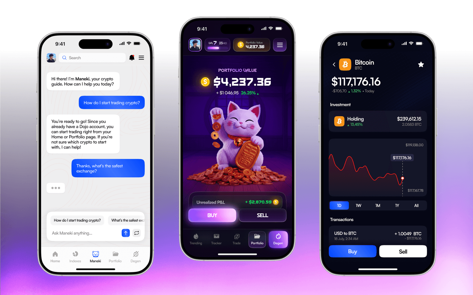
The biggest challenge was making these two modes coexist without feeling like separate apps. The solution was to create two distinct but coherent visuals. Normal Mode uses blues, which communicates trust. Degen Mode flips the script with deep purples, vibrant magentas, and Maneki as the mascot.
The result is a premium and adaptable app.
Normal Mode was designed to be the entry point for all users. Clean, professional, and approachable.
The color palette here is intentional: blues for trust. I wanted users to feel safe. Crypto can be intimidating for beginners, so the design needed to remove that friction. Everything is organized, nothing feels chaotic.
One of the standout features is the Indexes system. Think of this as the S&P 500 but for crypto. Users can invest in pre-built crypto portfolios created by the community, the Dojo team, or they can create their own. Want 40% Bitcoin, 30% Ethereum, 20% Solana, and 10% XRP? Done. This feature makes diversification effortless, which is huge for people who don't want to manually manage multiple coins.
Then there's Maneki, the AI assistant. It's not just a chatbot, it was designed to feel like a helpful guide. Users can ask questions, get insights, clarify doubts, and the AI responds in a conversational, friendly way. I designed the chat interface to feel natural and integrated, not like an afterthought.
The portfolio section is also smart. Users can filter their assets by "All," "Gainers," or "Losers," to instantly see what's performing well and what's not. It's a small feature but makes all the difference in daily usability.
Beyond that, I designed the app to work perfectly in both dark mode and light mode. Some users prefer dark backgrounds, especially when viewing charts for hours. Others prefer clean interfaces.
Normal Mode is where users will spend most of their time. Buying Bitcoin, Ethereum, Solana—the main cryptos. Creating indexes. Chatting with Maneki. Checking news. Sending, swapping, and receiving tokens. It's complete, functional, and easy to use. Exactly as it should be.

Degen Mode is where the app completely transforms. You activate the mode in the bottom navbar, a warning appears saying you're entering a high-risk zone, and if you accept, everything changes.
The colors shift to deep purples and vibrant magentas. The Maneki cat appears everywhere—not just as a mascot, but as part of the experience. The app becomes more gamified, more intense, more alive.
Here you're not trading Bitcoin. You're trading meme coins, coins that can skyrocket or crash 90% in minutes. It's high risk, high potential return, and the design reflects that. Everything is bolder, faster, more exciting.
I added gamification elements: levels, stats, achievements. Because people who enter Degen Mode don't just want to trade. They want to compete. They want to see rankings. They want to feel like they're progressing.
But I kept part of Normal Mode's personality. The structure is the same, the navigation is familiar. I didn't want it to feel like a completely different app. I wanted them to feel like they were evolving within the same platform. It's like going from casual mode to hardcore mode in a game.
The choice of purple and magenta wasn't random. These colors are associated with energy, creativity, risk, ambition. Exactly what the degen audience is looking for. And the Maneki cat? It's the Japanese lucky charm symbol, perfect for a mode where luck can change in seconds.
Users can exit Degen Mode at any time and return to Normal Mode without any issues. It's fluid, intuitive, and gives them total control over the experience they want to have.
