
The new Digital Marketing Academy platform project came from the idea of providing a better experience for all users. Better content organization, an easier-to-use platform on both desktop and mobile, and an overall more professional experience were the main points that drove this project forward.
The previous platform had a very unstructured and confusing design. Customers constantly complained about it. It was difficult to search for classes, navigating through courses wasn't intuitive, and the overall experience left a lot to be desired for a premium platform.
That's when I came in. The goal was clear: do a complete redesign that solved all these problems.
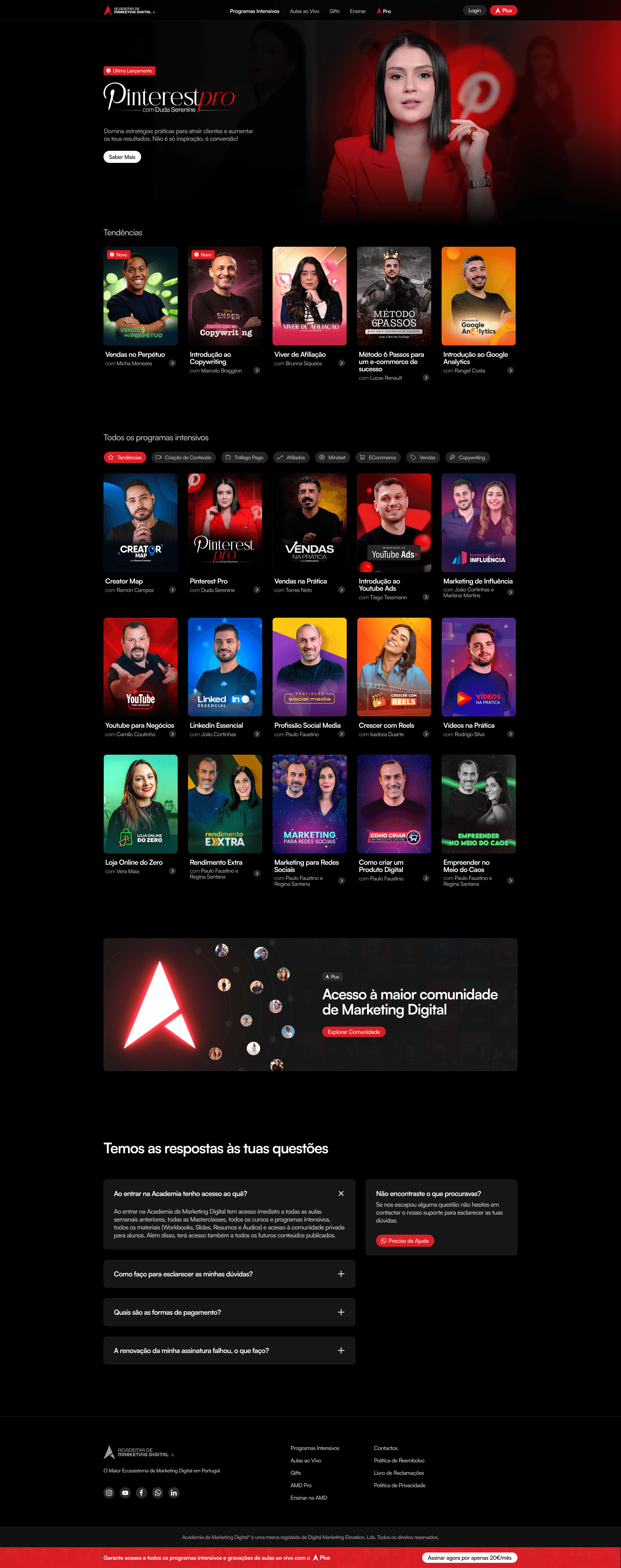
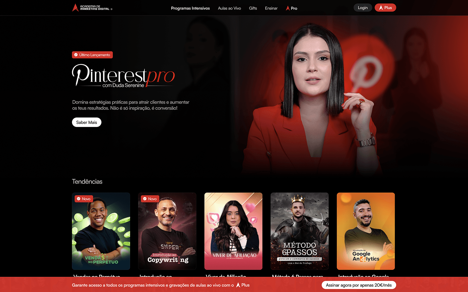
The first decision was the color palette. I kept the brand's iconic red but transformed it into the standout element. The dark background wasn't just an aesthetic choice. On a platform where people spend hours consuming content, dark backgrounds reduce visual fatigue. And they make important elements, like CTAs and course thumbnails, stand out.
The platform structure was completely rethought. I drew inspiration from platforms like Netflix and YouTube because these platforms have already solved the problem of organizing and presenting a lot of content simply. People are already used to this way of navigating, so for now, it didn't make sense to reinvent the wheel.
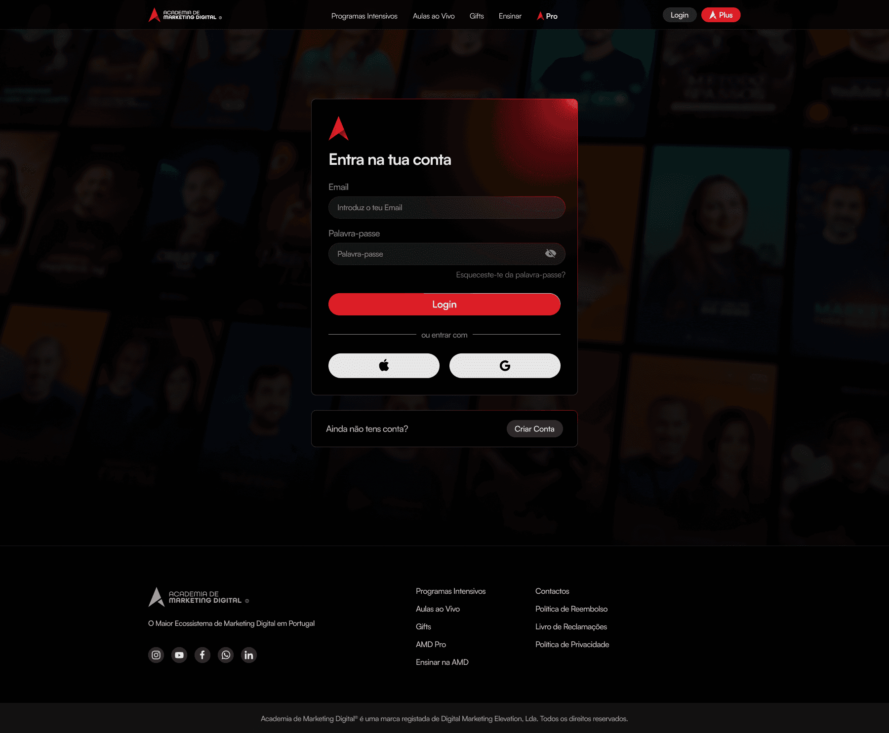
The login and registration system was also simplified. Options to sign in with Google or Apple, because no one wants to create yet another password. The easier it is to enter, the fewer drop-offs in the process.
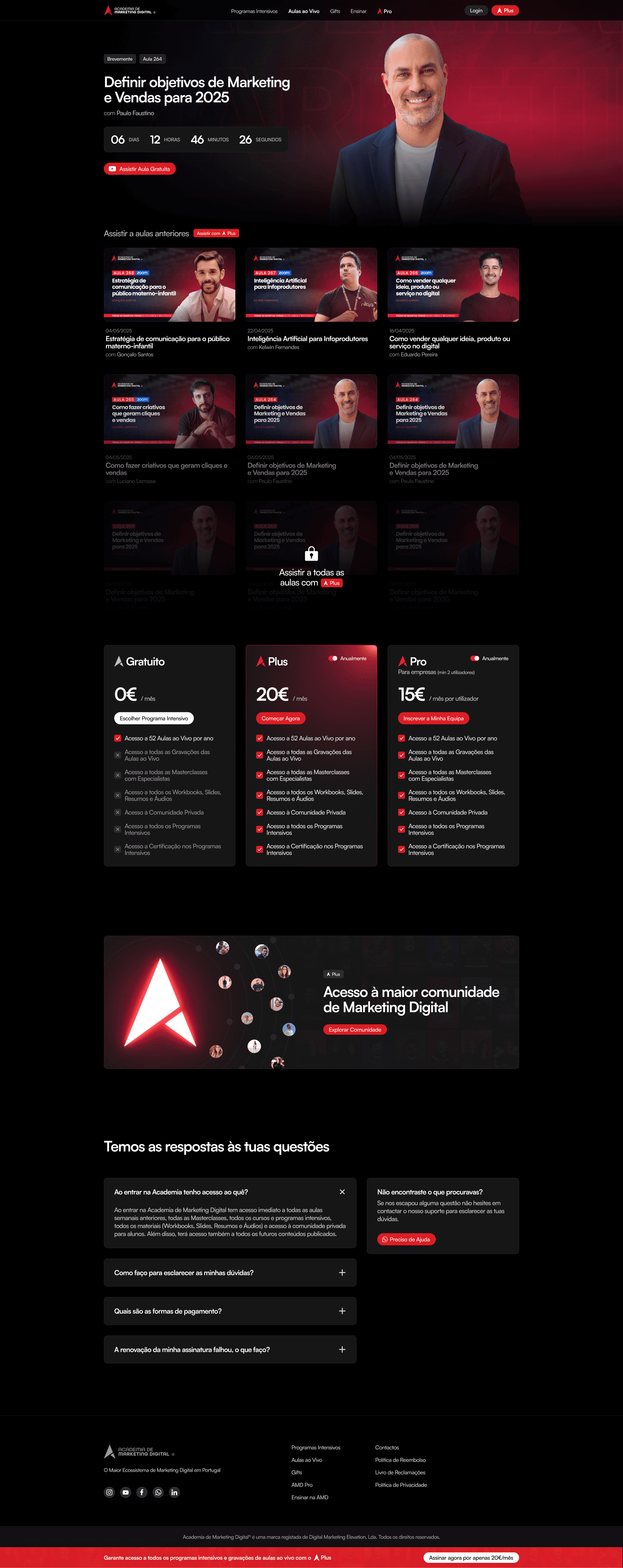
Individual pages for each program were designed to show all relevant information clearly: program content, modules, locked and unlocked classes, and subscription plans. Everything visual, everything simple.
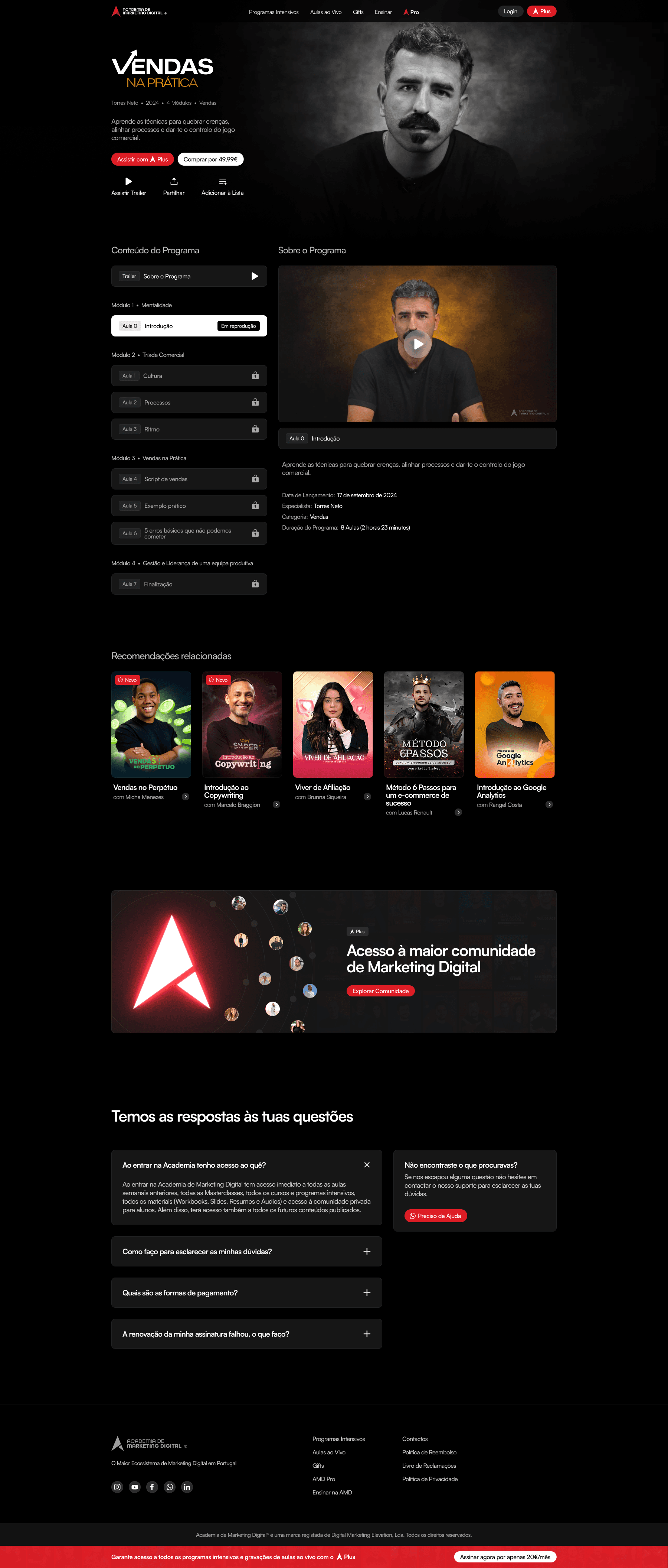
The result is a platform that looks premium because it is premium. Organized, professional, easy to use, and focused on doing one thing well: delivering quality content in an accessible way. Because there's no point having the best courses if the platform is a nightmare to use.